My illustration blog
Some thoughts on illustration and life
My Recent Posts
Abstract watercolor art
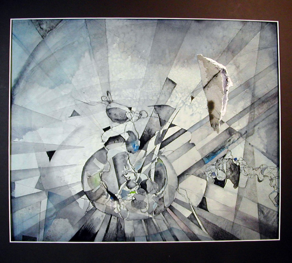
a work in progress
The Payne’s gray color emulates the tonal palette of black and white photography, which was my big influence in this case, from watching 1930s movies on TV as a child.
If I’m influencing young minds, does that make me an elder?
The Ketubah: Not Just for Jewish Wedding Ceremonies Anymore
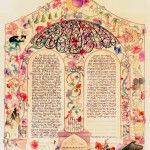
Garden Ketubah
I know what you are thinking: “Ketubah—it must be something like a tuba, right?” Well, you couldn’t be further from the truth. A Ketubah (sometimes known as Ketuba without the ‘h’) is best known as a Jewish Wedding Contract. It is a marriage contract that goes about 2000 years, essentially providing economic protection for the bride. This fact alone makes a Ketubah “progressive.” While photographs, invitations, and music might help you remember your wedding day, a Ketubah reminds you of the love and promises you have with one another.
A Ketubah Overview
A Ketubah (which is Hebrew for “marriage contract” and traditionally part of a Jewish Wedding Ceremony) is done in calligraphy and surrounded by decorative art that is as beautiful as the artist, or artists, can make it. No matter how detailed and lovely the art may be, without the calligraphy, the Ketubah is merely ornamental, but with words, it is a contract between man and wife and should be taken seriously.
While there is a traditional Ketubah Text that you can use, the Ketubot (plural) I create normally have Texts that evolve to become the couple’s wedding vows. In a short ceremony that precedes the normal marriage ceremony, the Ketubah text is carefully reviewed by both bride and groom and signed by the two people getting married, the officiate, and two witnesses. I love this moment. Watching two individuals sign a Ketubah (they are usually nervous because they don’t want to mess up the art) and pledge themselves to one another through a contract creates a unique, warm, and lifelong memory.
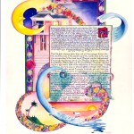
Interfaith Ketubah combining Irish, Hawaiian, and Jewish cultures with a water theme.
The Ketubah Process
I usually meet with the prospective bride and groom 3-6 months prior to the wedding date. Starting early provides us with plenty of time to help the bride and groom determine what is most important to them and identify what will and won’t be included in this art. At our first meeting, I will show a few past pieces, ask some open-ended questions, and do a bit of sketching. I then make a copy of the sketch for them to take home and review.
At our next meeting, we really begin to design the art, which includes the Ketubah’s overall shape, where the calligraphy will go, the content for the art and text (which is often quite personal), and the color scheme. It’s most rewarding for me to witness their growing excitement as this piece, which is all about them, takes life. Also, the couple will decide what is not important enough to include. It is fascinating to watch this negotiation, which is always done with love. To me, this is what a Ketubah is all about—distilling this couple’s love on to a 30” x 22” piece of watercolor paper.
Throughout the whole process, I take photos of the Ketubah in its various stages and send them to the couple. This allows them to see its progress, and, most importantly, to refine and revise it along the way. If they wish to come over to view its progress in person, they are welcome to do so at any time. After my part is nearly or completely finished, I hand the art over to the calligrapher. The calligrapher then scribes the couple’s chosen Text (which is often done in Hebrew and English) on the Ketubah.
You don’t have to be Jewish to have your own Ketubah
Most of the Ketubot I’ve done are Interfaith, meaning one person in the couple is Jewish and the other is not. A good Ketubah illustrator can combine a couple’s different cultures or origins through the use of symbolism, color scheme, and Text and create a piece of art that truly reflects their everlasting union. To me, a Ketubah is about two people’s love and not their religion, and I consider it an honor to create a Ketubah and to work with those couples in a “rarified state” leading up to their wedding day.
a few words on this comic strip
My autobiographical comic strip didn’t start out to be such. It grew organically from that “POW!” center section of Barney Google getting a fist in his face, which came from a very beat up 1924 Sunday comic section. It was only then that I asked myself, “What has had that “POW affect” on me?”, and the answer was “when I first saw comic book and comic strip art.
Then I began the narrative in the upper left, but wanted to keep the format fluid, so I have characters in different sizes moving from one panel overlapping to the next, and used depth, especially in the upper right corner panel, that shows 7 year old me flying over a geometric field of comic strip panels vanishing into the horizon. Lastly, I go back and forth from a child to an adult twice, adding to the expanse of time. (there’s also a reference to 21st century, of which this style of art is decidedly not)
All the memories are true, and I think that shows. Having my parents holding me back was a throwaway to fill up a small space, or so I thought, only to realize that for me it was the psychologically most complex part.
The piece is a collage, using the yellowed newspaper to visually tie things together (it amazed me how well this old paper held up to paste and water color!). I also used my polka-dot blue pajamas as a repeat motif to visually add cohesion. But, the eye keeps going back to “POW!” and the green burst around it, as those are the most intense colors on the page and the basic idea.
Autobiographical comic strip
This comic strip focuses on the moment I fell in love with cartoon art.
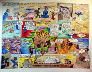
This is illustration of when I fell in love with comics.
Illustration, Graphic Design, and “Fine Art”- What’s the difference?
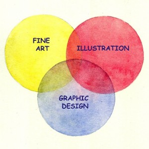 Because I’ve been a full time illustrator for 30 years, I’m always surprised when people confuse illustration with graphic design and “fine art” with, what, “not –so-fine art?”
Here is my explanation. Picture three rings that intersect and overlap one another in the middle, with each of those rings representing one of the following categories-illustration, graphic design, and “fine art.” Each one is an entity unto itself, and yet they have common areas. There are plenty of examples of one piece of art being all three at once, with the caveat being that the term, “fine art,” is subjective. I’m a fan of all three.
Illustration is what I do. I create images by drawing and painting them in ink and watercolor. While my work is done entirely by hand in “traditional media,” perfectly valid illustrations may be computer generated. Regardless of the medium, illustrations are images usually created to highlight something that is written first. The image is illustrating the written word, and bringing more attention to that message than if it was simply a written word.
When that illustration is combined with typography, as in a poster or advertisement, we’re in the category of graphic design. Graphic design normally involves words, layout, and combining those with images. Logos are usually considered graphic design, even if there are aspects of illustration in them. Those aspects are stylized and hard edged enough to blend in with the lettering, and this type of work is mostly done on a computer. I have hand drawn some logos, and those fall right in between the two categories.
The purpose of illustration is specific, as is that of graphic design, and, to put it loosely, they are advertising something, be it a product or an idea. A client, either individual or business, hires the person creating the illustration, or design. The artist knows that he/she will be paid, usually receiving a down payment to begin.
Fine art is art that is created by and for the artist. It can be anything the artist feels like doing at that moment. It may be representational. It may be abstract. Its intentions are to be “art for art’s sake,” and, after completion, the artist will try to sell it. Many aspects of illustration and graphic design, such as composition, use of color, texture, shadow, and subject, are also parts of fine art, and that is where the three categories intersect.
Lastly, an anecdote: many years ago, fresh out of college, I was chatting with two artist types who both did abstract work. I was already clearly more of a cartoon/illustrator. One of them said, “of course you know that our art is higher than yours,” to which I expressed strong disagreement. Some twenty years later, I was visiting people back home, and this artist happened to get wind of my presence. He found out where I was staying, came over, and apologized.
While snobbery may help in the world of art sales, I have no need for it. The lines are too blurred, and there is too much subjectivity and personal taste involved. Illustration is not a higher art form than graphic design nor is abstract art higher than illustration. Each form has its place in our culture and media.
Blue Herons as book cover art

Blue Herons for Robert Pack's poetry book on Lost Horse Press
The artist as Warrior!
 On the power of persistence: I have an affirmation that I am a “great, warrior artist”. When I tell myself I’m a great artist, that negates the possibility of my denigrating the quality of my own work. When I say I’m a warrior, it means I keep persisting without any whining. No whining allowed!
In the case of “Michellin Pop”, I am pleased witht he art on many levels, AND I blew it on the squared edges: they are distinctly off. The framer and I have tried a number of solutions, and today, when I thought we finally had it licked, (this was attempt #4!), it turned out that the framer’s assistant matted the art far too tightly, covering up small portions of the edges. I don’t know what he was thinking, but once again, this piece will stay at the framers for a while until it comes out as right as it can be, considering that it once had off kilter edges that have been straightened out in a way. The whole thing will still be “off” a bit, but in this case, that’s not so bad, and the square edges will conform to the mat, and all in all will have a clean look, which is what I feel the art needs, as opposed to “floating it” with no mat, and showing the deckled edges of the watercolor paper. Whew!
The warrior persists, and abides!
The artist warrior

Great piece, wonky edges
On being a warrior
So, I have an affirmation, “I am a great, warrior artist”. To say to myself that I’m a great artist means that I cannot denigrate the quality of my work. To say to myself that I’m a warrior means that I must persist with no whining allowed. In this case, we have “Michellin Pop” the piece I did recently that is displayed on my “pop art” page. I blew it on the square corners, and my angles were off by quite a bit, 3 eights of an inch. Ooops. What to do? First I took the art back home with me and tried to figure out a way to make the angles of the edges correct, but couldn’t.
I had a frame I wanted to put the art into, and I wanted it matted, but the framer and I first decided that we’d float the picture instead of matting it. They would tilt the picture ever so slightly, to cover up for the deficient square edges….but, that didn’t work, after one effort as the framer said the frame was too small, and we needed more space for this illusion to work. Ok, then, I said let’s do a bigger frame. I once again took the art home, and tore off a bit of the deckled edge, to help get the art looking a bit more squared off…..and, I didn’t really feel this was a piece to float, or to show the deckled edges either.
The cost now had quadrupled, and I knew I wasn’t going to really like the look of this, so I once again took the art home and this time I added a bit to all four edges to square those edges, although each part I added was, in effect, a long triangle.
I brought the art back to the framer, and he said it was now good enough to cut a mat for, and that illusion of clean edges and 90 degree angles would be intact.
Today I came to pick it up with great anticipation, and found this: the framer’s assistant cut the mat too close to the image, cutting off small parts of it. No good!!!
The warrior persists: let’s do it again! This piece WILL look great, as great art must, and the warrior will be victorious!!!